LUMÉ
A skincare label rebuilt around one clear promise.
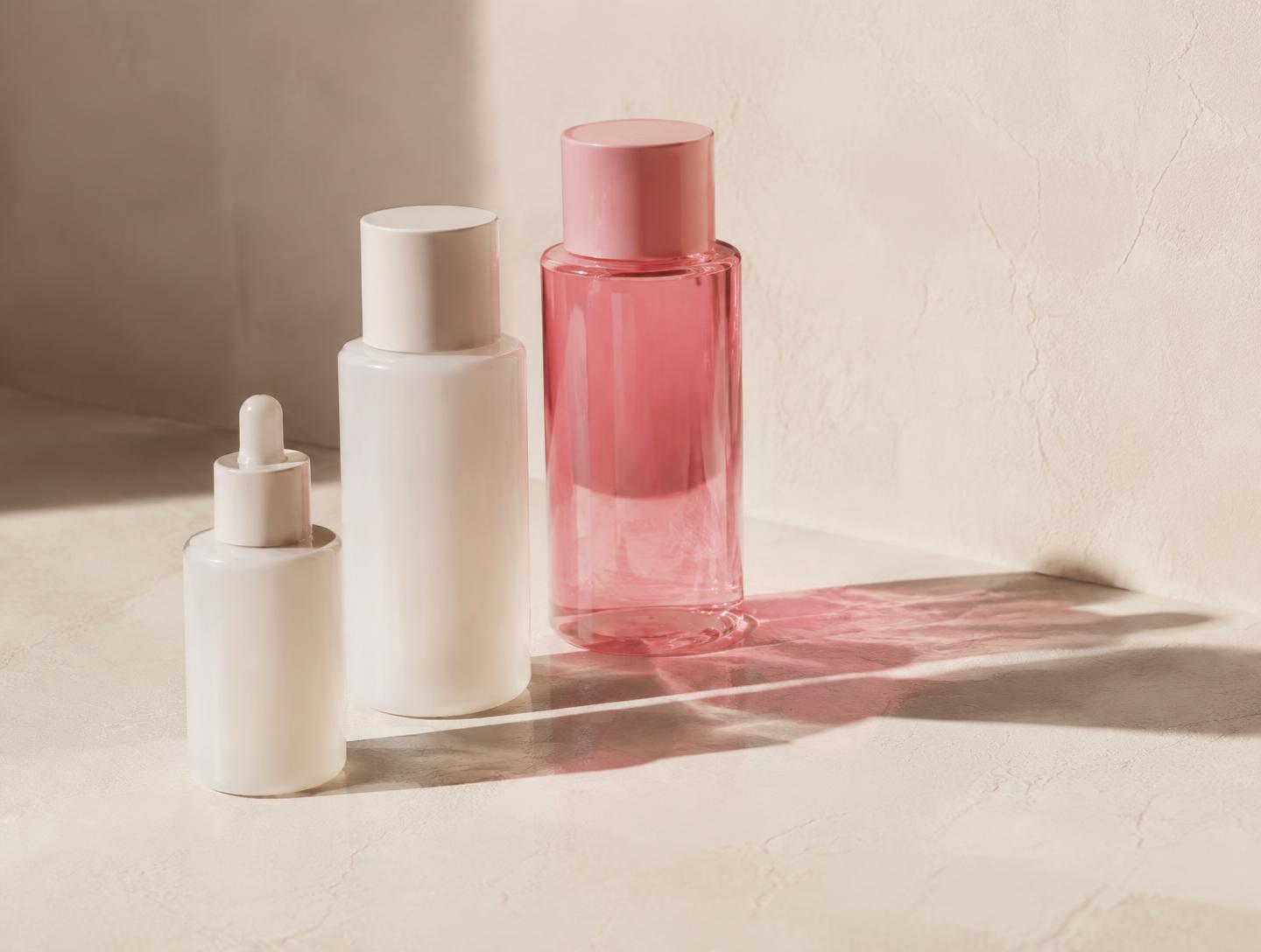
- Client
- LUMÉ
- Industry
- Beauty / E-commerce
- Services
- Brand · Web · Growth
- Year
- 2026
Challenge
Strong products, crowded category. LUMÉ had loyal customers but a store that explained everything and convinced no one.
Strategy
We narrowed the range story to a single promise, rebuilt the product hierarchy around routines instead of ingredients, and rewrote the buying journey to answer objections in order.
Creative direction
A quieter, more confident identity: editorial typography, warm neutral photography and pink used only where we wanted a decision to happen.
Execution
New identity system, a rebuilt storefront with routine-led navigation, refreshed PDP content, and a paid social programme with creative built per objection.
184%
Increase in conversion
3.2X
Return on ad spend
42%
Decrease in acquisition cost
"The Pink Digital didn't just redesign our brand. They completely changed how customers experience our business."
GOT SOMETHING
GOOD IN MIND?
Let's make it impossible to ignore.